Colour Psychology:
Which Colour is Best for Room?
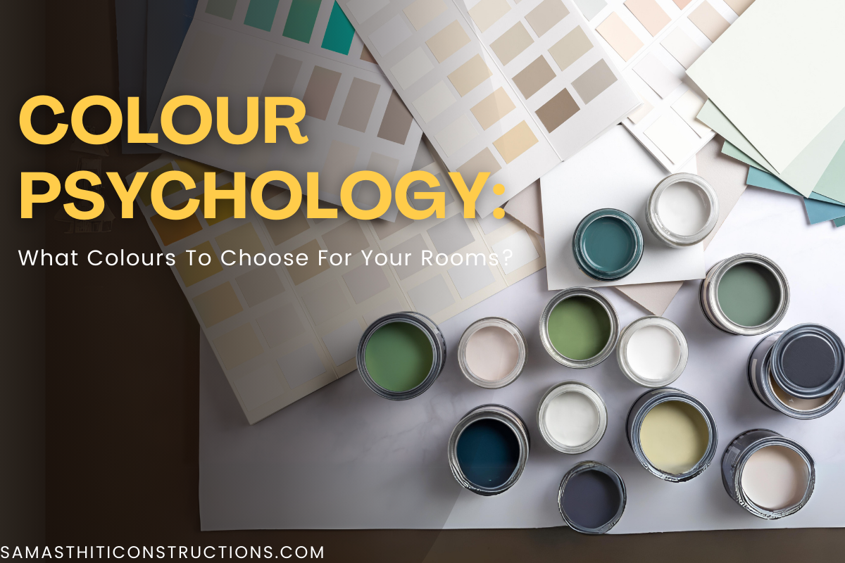
Table of Contents
A harmonious and welcoming living space is largely dependent on the colour scheme you choose for your interiors. Your home’s rooms have different functions, and the appropriate colour choice can improve both the ambience and usability of each space.
Room Color Guide: Choosing the Best Color for your Room
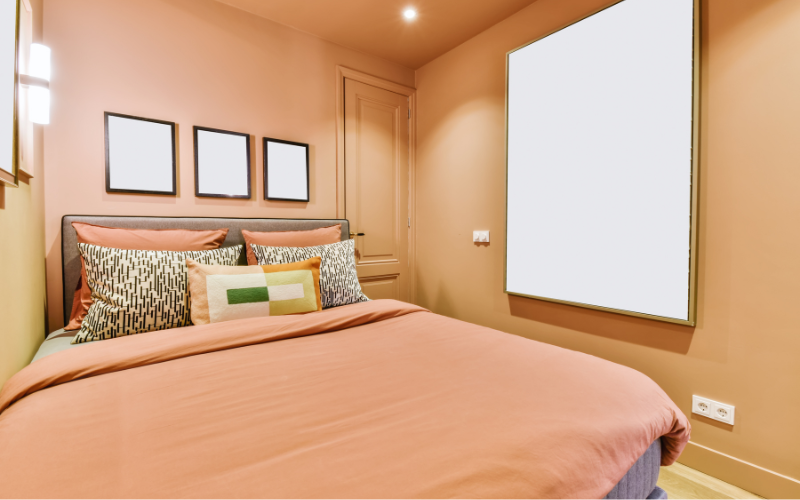
1. Bedroom
Since the bedroom serves as your private haven, tranquil, relaxing colors are ideal here. Calm, peaceful surroundings are created by the use of soft blues, muted greens, and gentle lavender tones. To create a comfortable and classic look, think about using warm neutral colours such as orange.
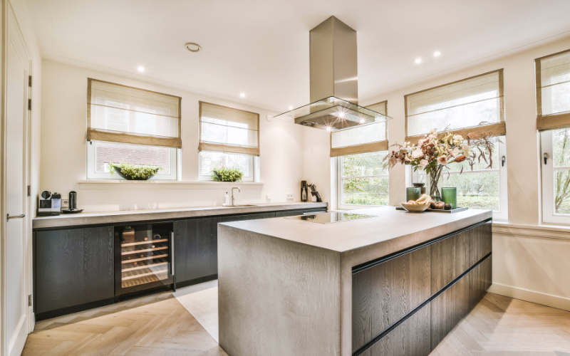
2. Kitchen
A harmonious combination of warm and cool colors is ideal for the centre of your house. The kitchen can appear light and airy by using soft greens, light blues, or crisp whites. In addition to providing a simple background, these colors make your kitchen’s appliances and accessories pop.
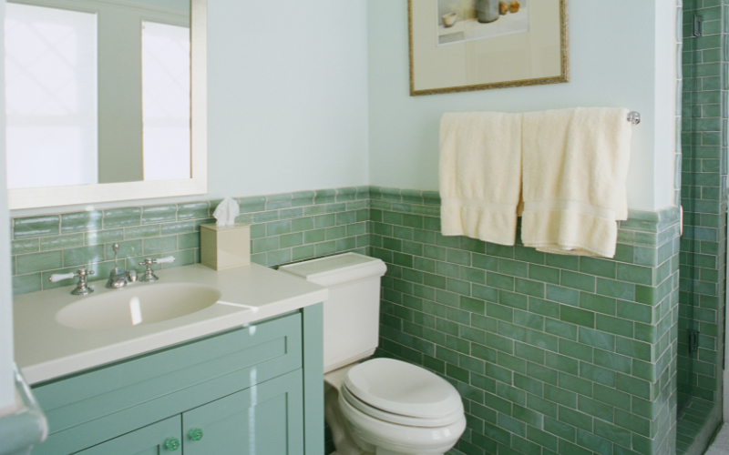
3. Bathroom
Clear, calming colours are a popular choice for bathrooms. A spa-like atmosphere can be created with soft blues, light greys, or pale greens. The room can feel light and airy by using white or neutral tiles with soft accent colours.
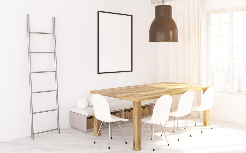
4. Dining Area
Gathering and sharing meals are frequently connected with the dining area. Cosy and welcoming dining spaces can be created with earthy colours like rich burgundy, deep green, or warm brown. To bring out the character of the space, think about adding a statement wall or classy lighting fixtures.
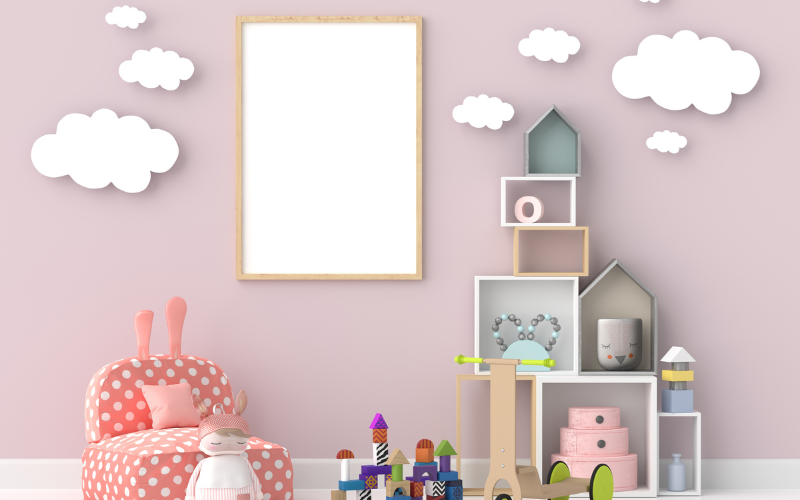
5. Kid's Room
Use colour to your advantage when designing a child’s room. Yellows, blues, and greens are examples of vibrant, upbeat colours that can inspire creativity and vitality. For easy updating when your child’s tastes change, think about utilising decals that are removable or vibrant accessories.
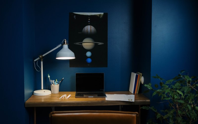
6. Home Office
Creating an environment that is suitable for working from home is crucial given the increase in remote work. Productivity can be enhanced by using neutral colours with accents of vibrant colours, like gentle blues or greens. If you want to improve your workspace, think about adding natural light.
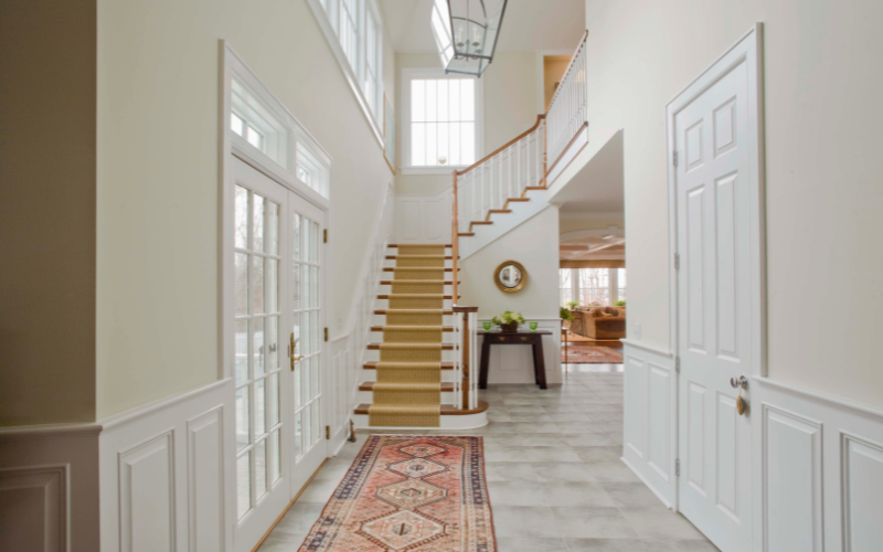
7. Hallway/Entryway
Welcome; lighter colors can create a good first impression and set the mood for your house. An atmosphere can be made to feel cosy by using warm neutrals, light greys, or soft yellows. Ample lighting and mirrors can give the illusion of larger, brighter spaces in smaller spaces
8. Accent Walls
Although the base colour scheme is usually neutral, accent walls provide a chance to introduce vivid or striking colors. To add drama and personality without overpowering the entire room, think about adding an accent wall to the dining area, living room, or bedroom.
9. Personalization
In the end, the colour that best suits your interior design is the one that complements your tastes and style. Don’t be afraid to play around with different colors and combinations to make a room that feels especially yours.
Conclusion
Keep in mind that the amount of natural light in each space, as well as its size and purpose, should all affect your colour selections. You can see how different colours will appear in your particular setting with the use of samples and swatches. You can design a home that not only looks good but also improves the mood and functionality of each living area by carefully choosing the colours for each room. Good luck!
Samasthiti Construction, a top interior designing company, can assist you in making the best color selections for your home.
Frequently Ask Questions?
Which colour is best for study room?
Pastel/light/neutral colours work best to increase concentration. According to Vastu, the best colour for a study room would be white, cream, pastel green, pastel blue and grey.
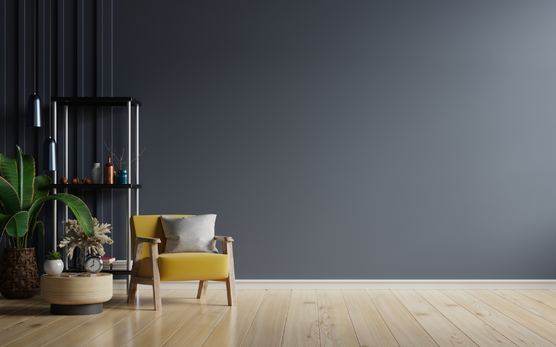
Which colour is best for living room?
The living room is frequently the centre of attention in the house, so the colour palette here should both express your personal style and promote conversation. Furniture and décor can be arranged against a variety of backdrops in neutral tones such as taupe, grey, or beige. Use throw pillows, colourful area rugs, or artwork to add accents with pops of colour.
Which colour is best for puja room?
According to Vastu, light colors like white, off-white, light blue, or yellow are best for pooja rooms. They create a peaceful atmosphere, great for meditation and prayer.
DESIGN, CONSTRUCTION NEWS DELIVERED TO YOU
Join our mailing list to receive the latest news and updates from our team.
DESIGN, CONSTRUCTION NEWS DELIVERED TO YOU
Join our mailing list to receive the latest news and updates from our team.